
Mobiles have become the new age web access points and the apps have become the new scopes of earning sales. Given this, the goal of every business is to have an app of their own. But, the old adage of “put it up there and they will come” does not work with mobile apps. No matter which niche business you are in, you have to overcome stiff competition to find a place in the users mobile (through app downloads). But, that is not all, an app can be uninstalled as quickly as it was installed. So, you have to dish out a superior experience to the users, whether it is through the offerings or by easy to find information. This can be attained with the help of a good UI (User Interface). Experts opine that UI is the most decisive factor in making an app successful or just one out of millions. So, today we take a look through some of the best practices of UI design.
- Clarity: Good UI designs do not confuse the users. They make it clear through language, visuals and well demarcated features. The best apps out there don’t have any user manuals, as they are so simple to use.
- Familiarity: When you use buttons, features or call-to-actions that the users are quite familiar with, they do not get lost. You can use icons, symbols or even colors (such as Red for Exit) to convey the message. By making your app familiar you inspire even the first time users to go through all the features and options.
- Responsiveness: The speed of an app is also essential for good experience. Messages that inform the user just what is happening at the back-end is a good way of keeping the users engaged. Suppose the user is making a purchase, just include a message which says “your purchase is being confirmed”.
- Consistency: Just like any other areas of branding, an app should remain consistent in its looks and feel. Each new feature should have the same usage pattern, so that the user can apply interface knowledge from one page into using another.
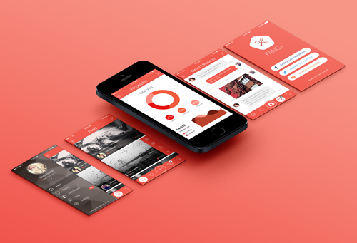
- Aesthetics: While it is not necessary, but users are more prone to use an app that looks attractive. A variety of color and patterns make the user’s time on the app very enjoyable.
- Fat Fingers: Researchers believe there are three different ways in which people hold their devices while browsing. Keeping this in mind, you should not make cursors or buttons thin. Users should be able to click on the features and buttons easily, and to attain this you have to make the buttons thicker.
While the best apps in your niche would have thousands of downloads each day, there are others which get none. Which category do you want to belong?