Tag Archives: web design services India

How often should a website be redesigned?

The decision to redesign your corporate website is not a simple one. It has many management and monetary facets to it. This is why, there are many website owners who are caught up in a fix: “when should I redesign my website?” Well, there is a popular saying “if it ain’t broke, don’t fix it.” But, this saying was not created keeping the web in mind. There are many websites which are completely functional from the apparent view (it ain’t broke) and still they are crying out for a redesign (fix). As web redesigning is a big decision, so we can understand the indecision you are suffering from. But, if your website is looking rather stale, outdated and far moved from other modern websites of the niche, then it is the perfect time to start searching for a reputed web design service.

But what is the real shelf life of a website?

There is no definitive answer to this question. The shelf life of a website can be 3 years, 3 months, 3 hours or even 3 minutes. It all depends on a range of business factors. But, we understand that this answer would hardly meet your curiosity. So, let us throw in some numbers. A study by the Orbit Media, on the average shelf life of websites, found that a website needs to be redesigned every 2 years and 6 months! But that is a generalized answer and might not fit your industry requirements.

Does the shelf life vary from one industry to the next?

Yes, definitely. There are some industries which go hand in hand with modern technologies. While there are others which might not mind much about what is happening around in the technology domain. If your website is into selling utility items (such as AC, electronic parts and industrial machinery, as examples) you do not need to care about the technology innovations out there. Customers care more for the quality of the items, rather than your websites looks. While if you are more into dealing with trendy things (such as interior decor, travel, new technologies, etc.) than the customers expect your website to have a modern look. Whether you need to redesign your website within two and a half years or after ten years depends on the expectations from your industry.

What can be an immediate trigger for website redesigning?

Standing at the present times, your website definitely needs to be mobile friendly. If it is not, then there is not a single moment to waste. You need to get in touch with a reliable web designing service and make your website mobile friendly. Even five years ago you could count the mobile visitors out of the equation. But no more, as Google officially states that mobile traffic in 2017 exceeded the desktop traffic. You could be losing a lots of customers and revenue if your website is not mobile friendly. This then is the immediate trigger for website redesigning.

What are the other considerations before thinking about website redesigning?

It all comes down to awareness. You need to understand the demands of the market. Finding answers to some of the below mentioned questions would help you make up the mind.

  • Is my website looking modern and updated?
  • Have my business offerings remained the same, since I last got my website designed?
  • Is my website appearing perfectly on all types of browsers, devices and screen sizes?
  • Is my website in the same league or better than my competitors?
  • Am I witnessing a steady growth in traffic and revenue through the website?
  • Is the website aligning with my present business goals?
  • Are customers giving compliments for my website design?
  • Do I really like the look and feel of my website?

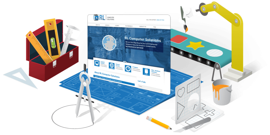
If you find that all the answers are pointing towards a website redesigning need, then waste no time in contacting us at Keyline. We have helped many clients give a new look to their existing website with our web design services.

5 Web Design Trends to watch out for in 2018

As a digital medium, web design services see most changes each year. While their print cousins have remained constant, the web design realm undergoes many trend shifts with every passing year. The year 2017 posed many technology challenges for the web designers, but it was amazing to see the web design world cut through the challenges and design websites that were user friendly, innovative and adaptable with the corporate style.

One of the major paradigm shifts in 2017 saw mobile searches finally overtake the desktop searches. This means, 2018 would be a year when the web designers have to care for mobile functionality while evolving with the desktop designs. Keeping all this in mind, let us try to find some of the major web design trends to care for in 2018.

Trend #1: Move towards Vibrant Color Schemes

2018 is definitely the year when the color palette preferences of the web designers would change. So long the designers and brands only worked with the web safe colors. But even in the last quarter of 2017, web designers had shifted from this norm. Web designers were seen experimenting and getting courageous with their selection of colors. Vibrant shades along with non-horizontal headers found a liking among the web surfers. The adoption of vibrant shades has been aided by technology too. With new technological advances, the monitors and devices of the present era can reproduce a diversity of rich colors.

Trend #2: Use of Drop Shadows and Depth

Shadows have been an integral part of web designing for many years now. But in light of the new advancements in web browsers, they have become more appealing then they ever were. In 2018, the web designers have the luxury of playing with grids and parallax layouts to create depth in designs and an illusion of a world beyond the screen. Drop shadows can increase the aesthetics and alleviate the User Experience (UX) of a website.

Trend #3: Focus on Mobile Surfing

As mentioned before, it is now official that surfers are using their smartphones to surf through websites, more than their desktops. Everyone today is using the smartphone to shop, place order and look for information on the web. A couple of years ago, the biggest dilemma for the web designers was: how to adopt their designs into the small mobile screen. But the mobile technology has matured significantly enough to solve their problem. Latest mobile technology enables the web designers to create menus, sub-menus and buttons without taking up much space. Yes, you might have to shun all those beautiful yet big photos and illustrations from your design, but the rest of the design can be easily accommodated within the mobile screen.

Trend #4: Use of Particle Backgrounds

This is the solution web designers have come up with to solve performance issues of their websites. With a video running in the background, many sites suffered from slow loading time. The animations done using the particle backgrounds are lightweight and they do the tasks a video is targeted to achieve. If an image is worth thousand words, then a moving image is much more than that. So, with the adoption of particle backgrounds one can immediately attract user’s attention and create a favorable first impression. Such motion graphics have already gained popularity on social media and campaign landing pages. It is now time to implement them on the web pages.

Trend #5: Bigger and Bolder Typography

Every web designer knows that typography is the most powerful visual tool that they can dish out for the surfers. With the right selection of typefaces you can set the right tone, evoke emotions and reflect the brand personality. As the resolutions of the device monitors are getting sharper, it is making fonts easier to read. With the exception of Internet Explorer, all the other browsers are today supporting the hand-made and innovative typefaces. The typeface trend of Sans Serif with Serif headings will be explored widely even in 2018. This year will be an year of invention in terms of typography.

If you are looking for a web design service that uses the latest technologies and trends in servicing the clients, then you have to Contact us at Keyline.